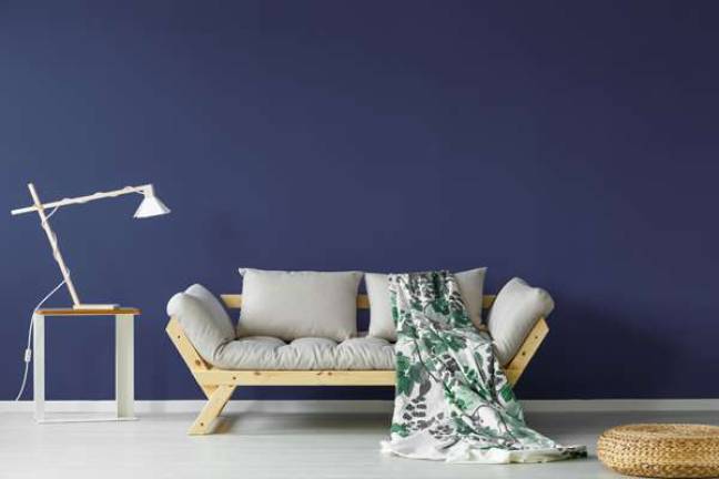
This fall, decor's deep, rich hues are bolder

Deeper, richer hues are often part of decor's autumnal palette, but this year they're bigger and bolder than usual.
“Color is a powerful communicator,” says Pottery Barn spokeswoman Monica Bhargava. “It can be a key point of inspiration that defines the mood and feel of a home.”
Dee Schlotter, a color marketing manager, sees a trend toward interiors “that embrace nocturnal shades” in homes, hotels and stores.
Deep hues are often incorporated through matte yet soft materials, she says.
IN THE MOOD
“I love dusky blues, plums, gray of all types, and surfaces that have a mysterious effect,” says Jamie Drake of New York-based Drake Anderson Interiors.
For the guest bedroom of one project, Drake/Anderson had a painter create a strie effect with an iridescent blue top coat, evoking a moody retreat.
In another apartment, Drake says his company used deep plum tones to anchor the high-altitude rooms, while another project employed dark navy walls in a cozy library. “Using a color this dark in a small space is a favorite tool to make the edges of a room `disappear' and create a mysterious illusion of more space,” he says.
Some deep, dark colors evoke privacy, quietude and a feeling of being wrapped in warmth, designers say. But brighter, saturated hues can be uplifting and electric.
EMERALD CITY
Of the trending deepened hues, emerald green is especially dominant, Schlotter says. To her, “It represents luxury and emulates lush foliage.”
“Color palettes that range from darker shades like black and navy, to gold and coral, complement the depth of emerald green,” she continues, “while pale neutrals like white and light gray give it a crisp and trendy edge. A courageous color, emerald green also works well with a number of materials and textures.” Emerald is showing up in upholstery. Furniture company Sauder has a little tub chair in the hue. CB2's 50s-inspired Avec sofa comes in plush emerald velvet.
COLOR IN THE KITCHEN
Italian company Bertazzoni, known for its high-end ranges in rich shades like burgundy, orange, yellow and red, just introduced a new hue called Azzurro. Blending cerulean, turquoise, sapphire and cyan, it's a positive, energetic color.
Both Frigidaire and Kitchenaid have suites of appliances in black stainless steel.
And look for countertops and cabinetry in deeper tones, too. Cambria Quartz's Bala Blue stone is the color of deep water. In a contemporary kitchen with sleek white cabinetry, Cardigan Red's vibrant warmth would be a terrific foil.
WALLS AND FLOORS
Intrepid decorators will love another aspect of this trend: dark walls.
At Kip's Bay Show House a couple of months ago, Susan Ferrier dressed a bedroom in deep forest green. Organic objets d'art accents made it feel like a luxe nature retreat.
Kevin Lichten and Joan Craig cloaked a downstairs bar in charcoal silk, trimmed with bronze, creating an intimate, sexy space.
LOOKING AHEAD
If you're interested in dabbling in any of these colors, don't worry about the trend being short-lived. PPG, Olympic Paints and Glidden announced their 2018 Color of the Year choices: Black Flame, Black Magic and Deep Onyx.
And Schlotter reports that PPG's color story for 2018 will be replete with deep, rich colors like smoky greens, luxurious purples, and charred gray-blacks.
They've given the palette an intriguing name: “Brave”.
“These colors,” says Schlotter, “reflect consumers' growing yearning for protection, strength and stability; to feel safe during uncertain times.”