Five decorating trends from 2017 to be replaced


In the world of home design, there’s no dirtier word than passé.
It’s a term that signifies something is past its prime and destined for the dustbin of décor history (or at least for a few years until it probably comes back in vogue).
Now that 2018 is full steam ahead, many home interior experts are eager to suggest fresh and exciting ways for homeowners to reimagine their living spaces.
Problem is, many of their clientele are still smitten with design trends that were all the rage last year.
It’s time to move on, say the pros.
“Trends come and go quickly because people’s tastes change,” says Tracy Stern, founder of New York City-based T&T Design. “It’s important to replace outdated styles in your home so that you feel inspired.”
There’s another essential reason to keep up with the latest home design drifts, too.
“For the resale value of your home to stay on par, it’s crucial to keep styles and décor current,” Matthew Rosenberg, owner of M-Rad Architecture and Design in Los Angeles, says.
And no better time than the present.
“I like making changes at the beginning of the year, because it means starting the year fresh and new,” says Michael A. Menn, architect/principal with Michael Menn.
He adds that it’s never too late to make a New Year’s resolution to update key areas of your home.
Here are 5 decorating trends that should have died when 2017 expired, and 5 better ideas for 2018:
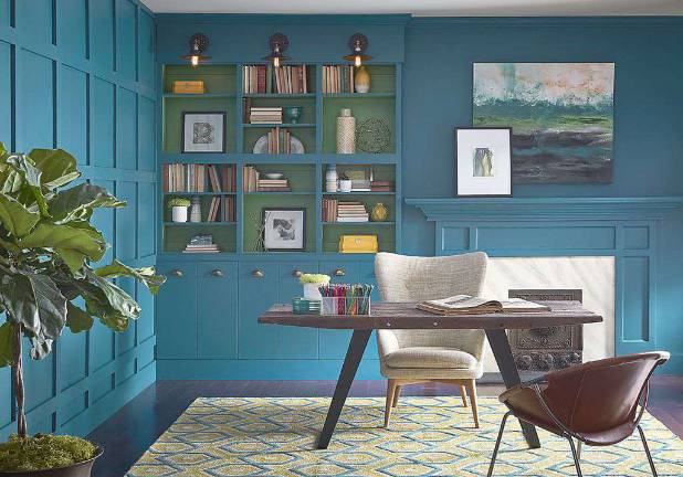
In — Intense color
“We’re done playing it safe – we want something that makes us excited,” says Straight, who cites 2018 paint color of the year choices by Pantone (18-3838 Ultra Violet), Sherwin Williams (Oceanside SW 6496) and Benjamin Moore (Caliente AF 290) as proof that consumers crave more vibrant hues.
Out — Linen
“I see it sticking around as a staple,” says Straight, “but this lead singer has been demoted to backup dancer as we look for something with a little more showmanship to offer.”
Out — White walls
Both Sherwin Williams and Benjamin Moore select shades of white for their “color of the year” in 2016, and the inclination toward ivory continued into 2017.
“But once there’s no color to look at on the wall, you have to find interest elsewhere. Now, this look has become too impersonal,” says Mandy Straight, an interior designer.
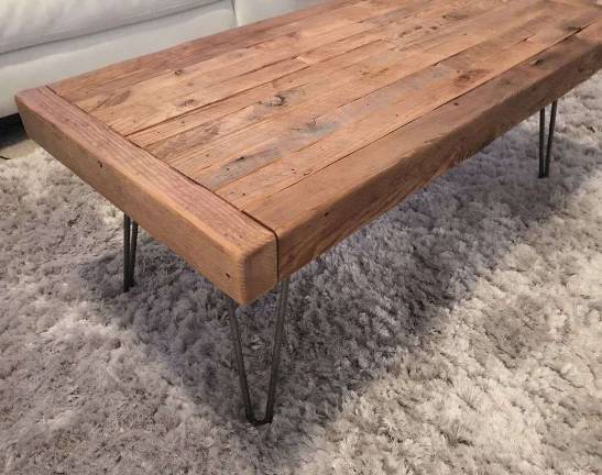
In — Classic coffee tables
A classic, handcrafted wood coffee tables that showcase natural décor like a tabletop fountain is the way to go.
“Incorporating woods, stone and water provides a level of organic appeal,” Rosenberg notes.
Out — Pink
Jennifer Adams, an interior designer, says “hot pink, raspberry and bubble gum are fresh, youthful and fun colors, but are too overwhelming in large doses, such as on walls or major pieces of furniture.”
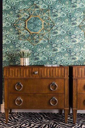
Out — Brass accents
“Last year, homeowners went slightly overboard here. Too much brass can often look cheap when overdone,” says Stern.
In – mixed metals
This year, “consider mixing metals, like oil-rubbed bronze and chrome fittings, to accent your home with a more sophisticated look,” Stern suggests.
In — Lilac
“This hue is a newer, bluer version of the blush we’ve been seeing everywhere for the past two years, and we anticipate that it’ll begin filtering into home décor very soon,” says Erika Woelfel, vice president of color and creative services at BEHR.
In — Velvet
Unlike dry, basic linen, “velvet is like a great date that loves us back,” Straight says.